Why Every Toothpaste Looks the Same
Aidan Tan
QULIT Staff Writer
Walk down any oral care aisle and you'll notice something strange. Almost every toothpaste brand looks the same. White packaging. Blue accents. Scientific claims. Smiling dentists. The category has become so obsessed with signaling trust that most brands have ended up looking interchangeable.
That's exactly the opportunity OZEN saw.
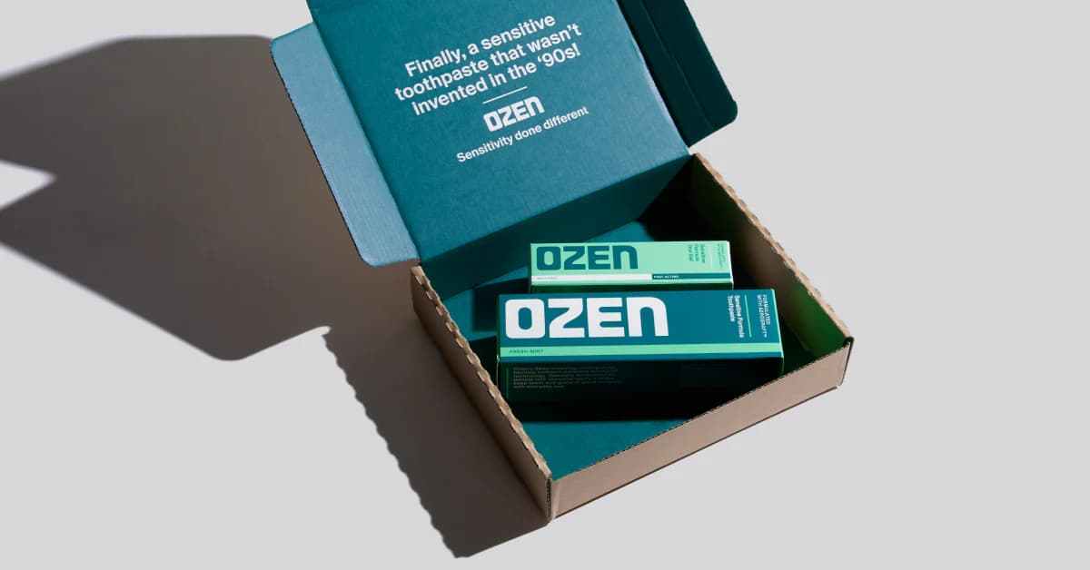
Founded by NHS maxillofacial surgeon Dr. Niall Kent, OZEN launched nationwide in 800+ Boots stores with AeroGraft™, the first new patented sensitivity technology to enter the category in nearly 30 years. But instead of relying solely on product innovation, the brand invested just as heavily in how that innovation was presented.
Working with Mother Design and startup incubator Broody, OZEN deliberately rejected many of oral care's visual clichés without abandoning the signals consumers still rely on. The bold sculptural wordmark, deep green color palette, and restrained packaging feel noticeably different from the sea of blue-and-white competitors. Yet the design still communicates efficacy and scientific credibility, avoiding the trap many challenger brands fall into where looking modern comes at the expense of trust.
That's the real lesson. Great branding isn't about breaking every category rule. It's about knowing which rules customers need and which ones everyone follows out of habit. OZEN kept the cues that build confidence while redesigning everything that had become predictable.
For marketers, it's a reminder that differentiation doesn't always come from shouting louder. Sometimes it comes from making familiar things feel fresh. In categories where everyone copies the same visual language, looking different can become your biggest competitive advantage.
The takeaway? Distinctive brands don't ignore category codes. They edit them.
Sources: Creative Review, The Checkout, Mother Design